A homepage built around your lines
Line cards that name what you write, in the words a shopper searches for.
Pick the book you write. Each page shows the pages, the quote form and the plan that fit it.
See all agency typesProperty and casualty
What the site carries and what we keep running for you, with the plan each one sits on.
See all featuresWhere quotes start
Design and build
Search, redesign and scale
Reading, answers and the people who write them.
Plans $127 a monthLive in 7 days$697 build fee, invoiced after launchDomain and hosting included
Design and build
Search, redesign and scale
Insurance agency website design is not a moodboard exercise; it is the layout, type and colour decisions that decide whether a visitor who is ready to shop finds your quote form or gives up and calls a carrier's 800 number instead. Most agency sites fail here quietly: the design looks fine in a screenshot and still loses the visitor because the path from headline to form is three clicks longer than it needs to be.
What it costs
Who it is for
Agency owners whose site looks acceptable in a screenshot but never produces a quote request, and who want the layout, type and colour decisions made around the form rather than the logo.
If two or more of the signs on this page sound familiar, this is the page for you.
Visitors reach the home page and leave without opening a single line page.
The quote button looks like every other link, so nobody notices it on a phone.
Each page was designed at a different time and none of them match.
The form sits in a sidebar, styled by whatever the lead vendor shipped.
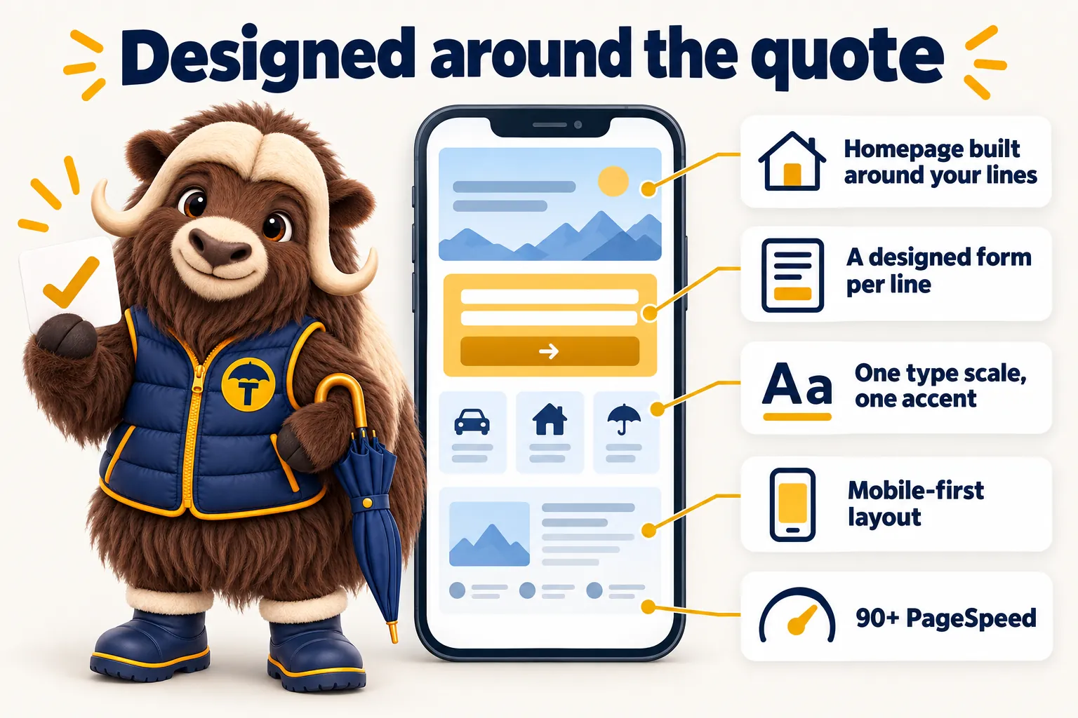
A visitor lands on an agency homepage already knowing what they want, home, auto, a BOP for the shop they just opened, and the design job is to get them off the homepage and onto that line's page in one decision. We build the top of the homepage around a short set of line cards, one per line you write, each with a name a homeowner or a business owner actually recognises rather than an internal carrier code. The visitor picks their line, lands on a page written for it, and sees a form built for it. Nothing about this needs a slider, a video background or a stock photo of someone in a hard hat; it needs the lines named clearly and the click target obvious on a phone, with the fewest possible steps between the two.
A display face for headings, a plain body face for paragraphs, one accent colour reserved for the thing you want clicked. We do not run five colours competing for attention or three fonts that all say something different about the agency. The accent colour appears on the quote button, the phone number and nowhere else, so a visitor scanning the page in three seconds knows exactly where to tap. Radius, spacing and shadow follow one system across every page rather than drifting per section, which is the detail that makes a site feel designed instead of assembled from a page builder's default blocks stitched together over a few afternoons by whoever was available.
Most agency sites treat the form as an afterthought embedded from a lead vendor, styled by whatever CSS the vendor shipped and dropped into a sidebar as if it were an advertisement rather than the entire point of the page. We design the form as part of the page: field order that matches how a producer actually asks the questions, a short field count so it finishes on a phone without pinching to zoom, and a confirmation state that tells the visitor who will call and roughly when rather than a generic "thank you" that leaves them wondering if it worked. 5 revisions a month means the form keeps changing as a carrier adds or drops a requirement, at no extra design cost and without waiting on a developer's schedule.
The site reads the same design language whether the visitor has the browser set to light or dark, and no section flips to an inverted colour scheme partway down the page, which is a common tell of a template stitched together from mismatched sections bought off different marketplaces. One radius system, one accent colour and one type scale apply consistently from the hero to the footer, in both themes, and we check every page in both before launch rather than treating dark mode as an afterthought nobody tests. A shopper comparing agencies late in the evening in dark mode sees the same considered brand a daytime visitor sees in light mode, not a jarring, unfinished-looking section that undermines the trust the rest of the page built.
Everything below ships on every plan, alongside hosting, a free domain, weekly updates and researched articles.
Line cards that name what you write, in the words a shopper searches for.
Field order and length matched to what each carrier needs to start a quote.
Applied consistently across every page, in light and dark.
Designed and tested on a phone screen before it is checked on a desktop.
Design decisions that do not cost you load time: no heavy sliders, no auto-playing video.
5 revisions a month included, so the design adjusts as your book does.
I tested the personal coverage inquiries page on my own phone before we approved anything. The essentials are within the first screen, with an obvious way to inquire. It is far more practical than the old page when we share it with a caller.
The preparation page for personal coverage inquiries works because it keeps its focus. It explains what the first conversation needs, and deliberately asks for nothing sensitive online. First conversations are shorter and better because of it.
Four steps, and you pay for the build only after you have seen it live.
Every visitor ready to shop leaves through a phone number, or leaves nothing at all.
Pick a plan on the pricing page. The first month is the only thing you pay before the site exists.
We do not yet know your lines, your carriers, your towns or the system your producers work in.
Lines you write, carriers you are appointed with, towns you serve, producers, and which CRM or AMS the requests go into. Anything missing can follow later by email or as a portal ticket.
Not one line you write and not one town you serve has a page of its own.
Pages, quote forms, integrations, articles queued. You review a live link and send changes as revisions.
The build is not paid for, and you have not seen the site it paid for.
Once the site is live and you have approved it, we invoice the $697 one-time build fee. Not before.
See insurance agency website design applied to your own agency on a half-hour demo. Plans $127 a month.
Book the demo$127, $267 or $647 a month
Single Line, Multi-Line, Agency Book. The plan, not the page count, sets the price.
$697 build fee, after launch
Invoiced once the site is live and you have approved it. Never up front.
Live in 7, 10 or 15 days
By plan, counted from the onboarding call, once we have your lines, carriers and towns.
What moves the price
Only the plan you choose, AI usage at cost on the AI plans, and revisions beyond 5 a month.
Plain about the edges, so nothing surprises you later.
See it live before the build fee
You approve the live site first.
90+ PageSpeed, or we fix it
On every page we build and host, at no charge.
No contract term
Cancel with 2 business days notice before your next invoice; keep your domain and content.
Built with US rules in mind to help you meet them; you approve the final wording.
Client builds where this work did the heavy lifting, each with the timeline and the outcome.
Case file 02
When somebody rings about personal coverage inquiries, I send one link and tell them exactly where to tap. The guided tour of our menu is no longer part of the call.
When it comes to personal coverage inquiries, the distinction between asking and agreeing is now explicit.
The whole job is getting a visitor to a quote form for a specific line of business, not just describing the agency. That means the homepage, the navigation and the layout of every page are built around naming lines clearly and putting a short form within reach, rather than the generic "about us, services, contact" structure most small business templates default to.
Yes. We start from your logo and brand if you have one, or build a simple palette and type pairing if you do not, then apply it as one accent colour and one type scale across the whole site. You review the design before anything is built out further, and colour or type changes count as revisions afterward.
Yes. The homepage's line cards and the site navigation are built to add a line rather than needing a redesign. Adding a new line page with its own form is one revision, included in the 5 a month on every plan.
Design is not billed separately from the build. Plans start at $127 a month with a $697 one-time build fee invoiced only after the site is live and you have approved it, and that covers the full design, not just a template.
You review the design on a live link before anything is built out further, and changes after launch are revisions: 5 a month included, of any size, then $20 each. There is no separate design fee and no round limit before launch that you will run into for normal feedback.
Yes. We start from your logo, colors and any brand guide you have, then apply them as one accent color and one type scale across the site so the website looks like the agency a client walks into.
No. We use photos of your office, your team and your area where you have them, and carefully chosen, relevant photography where you do not. Stock images of handshakes say nothing about your agency.
Every page is designed and tested on a phone first, then checked on tablet and desktop, in light and dark mode, before launch.
A live walk-through of the site you would get, in about 30 minutes. Plans from $127 a month, the $697 build fee invoiced only after launch, domain and hosting included.
Book a demoOr email and a person replies within one working day.
GetInsuranceWebsite uses the cookies below. Necessary cookies keep the site working and cannot be turned off.
Saved on this device only. Press Esc to close.